Prototype: Multiple Aliases of the Same Document (Round 4)
In designing Zoomed-In View, one of the challenges is indicating that there are multiple aliases of the same document. Below are variations of applying a color code.
Verison 1
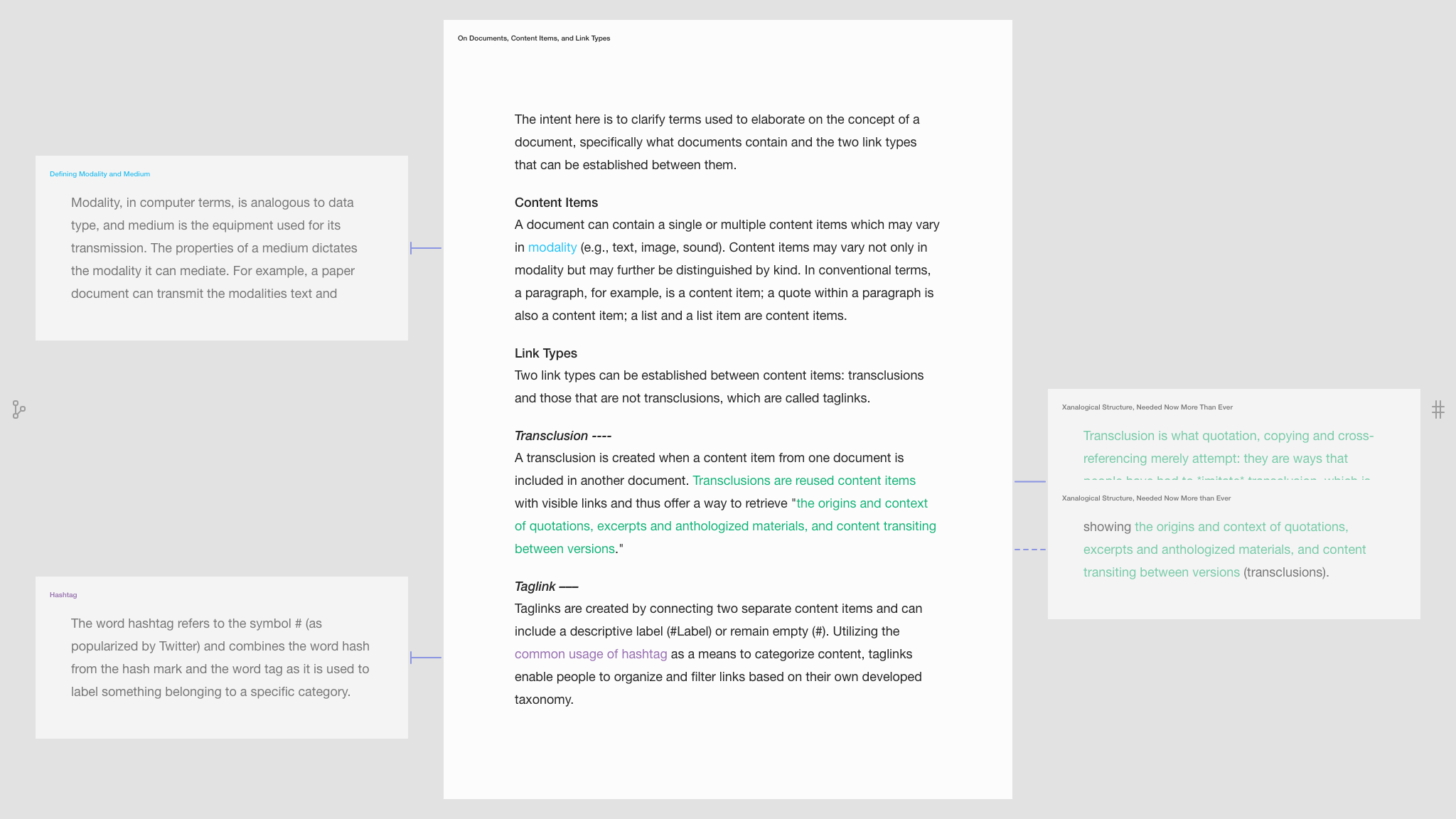
In version 1, linked content items share the same color.

In the top-left corner in the image above, the blue color-coding and shape of the link indicate that the word “modality” in the middle document is linked to the entire side document. In the bottom-right of the image, the green color coding and shape of the link indicate that only parts of each document are linked.1
Verison 2
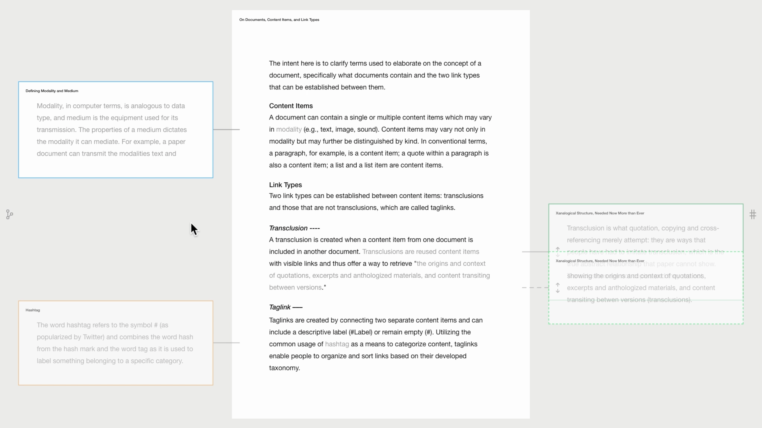
A color-coded border around the side previews is applied in version 2, as seen in the image below. All linked content is gray, including the links.

Verison 3
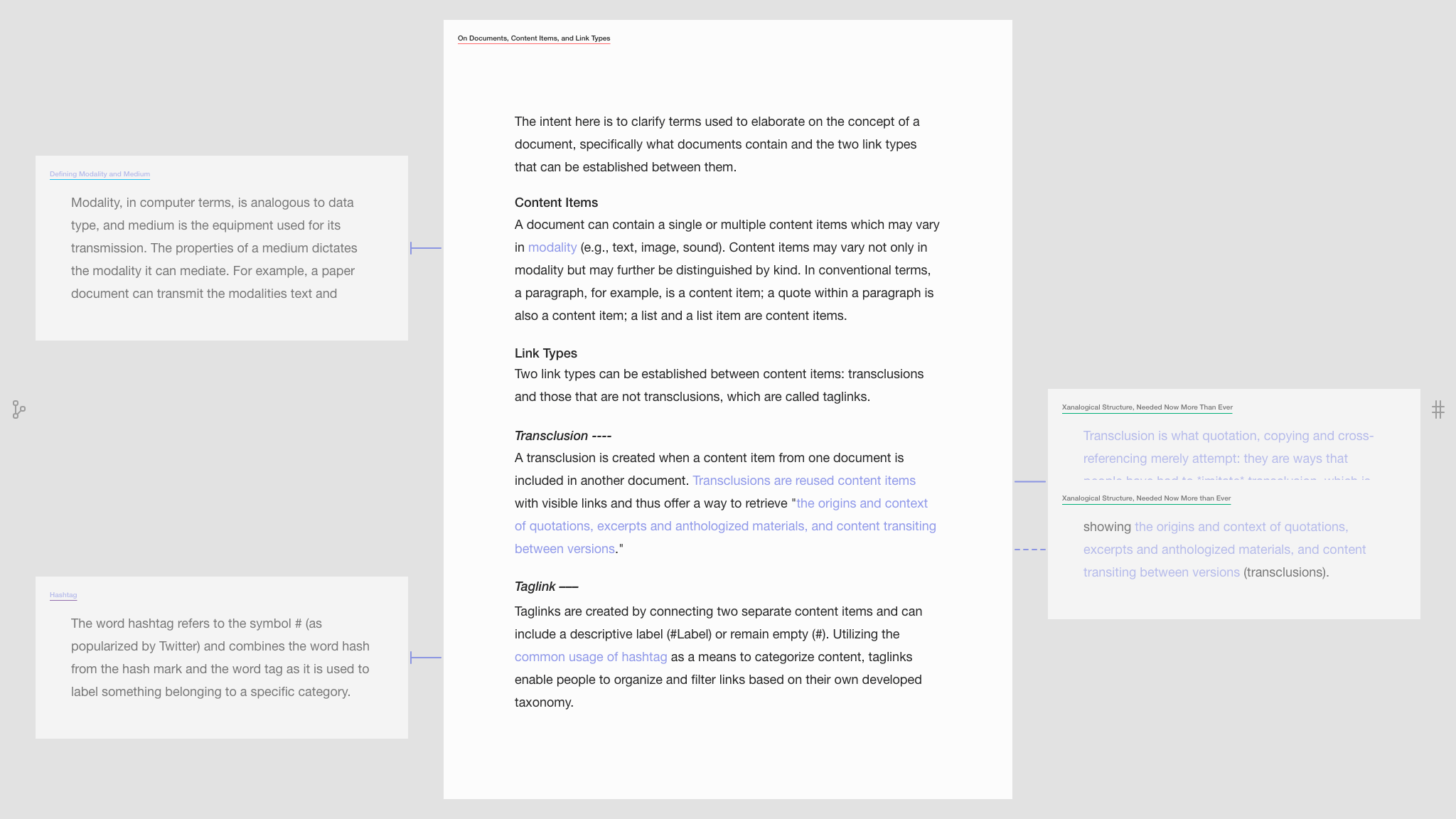
A more subtle approach is taken in version 3, having underlined titles. Additionally, all linked content items are purple, while navigation icons remain gray, indicating two distinct categories of information.

Interactive Prototype
The next entry reflects on the potential of the link types developed so far.
Having multiple colors throughout the main document may become distracting. ↩